Overcast Review
Overcast Review
Overcast Review

Overcast
Strategy
Make a simple to use podcast catcher with complex technological sound engine as a differentiator.
Scope
By focusing on doing a couple of things well (smart-speed, list creation & ordering, social discovery), the app eschews a ‘do-it-all’ podcast client. Overcast even lists it primary competitors as alternatives for those who don’t think Overcast is right for them. The apps more impressive features are unlocked through an in-app purchase, but the free version will serve as a simple way to subscribe and order podcasts.
Structure
The app has three ‘modes’, the default podcast list, a playing now mode, and a section mode. Whenever the user selects a podcast, a now playing screen appears with custom playback controls. Whenever the user selects a different section of the app, the app extends to another screen. Both of these non-default modes have a back arrow at the top right corner to give the user an impression that the spacial ‘home’ of the app is the list of playlists and podcasts.
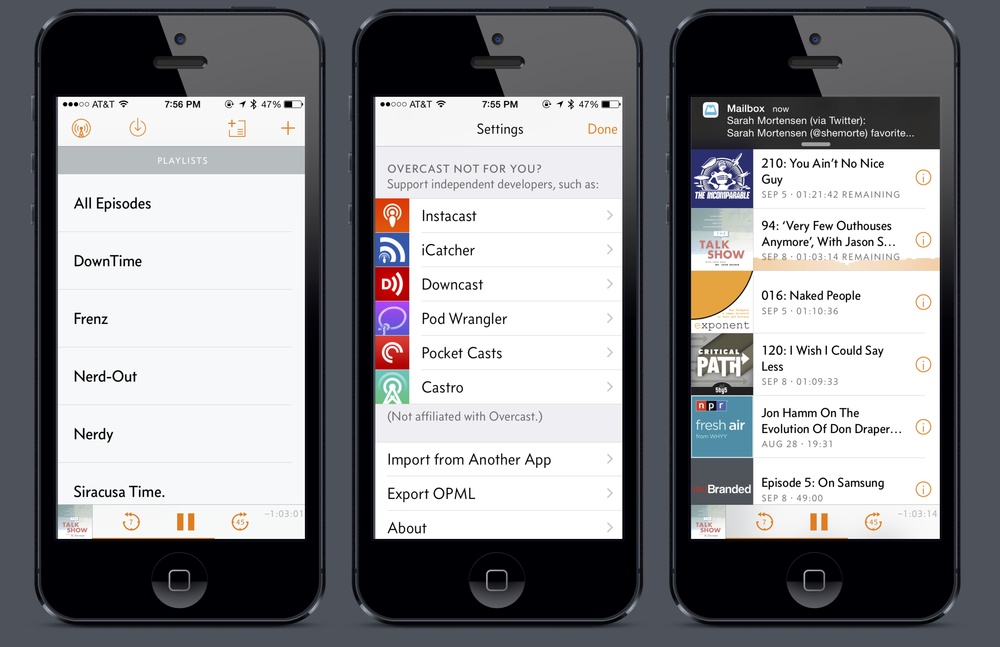
Skeleton
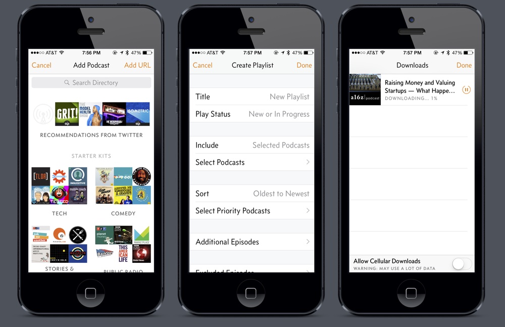
The app is set apart into 5 main sections. The primary and defaulted section displays playlists, follow by an ordered section of all the podcasts you’ve subscribed to. At the top of the screen, four icons serve as portals to other areas of the app. The first icon takes you to more information about Overcast and it’s settings. The second shows you a queue of your podcast downloads. The third allows you customize your playlists and their settings. The last section allows you to browse a catalog of podcasts recommend through curated lists and through your social networks recommendations.
Surface
Since the app is powered by a solid apical structure and has some well thought out benefits, Overcast shines with visual representations. For instance, if a podcast is playing, the user sees the EQ for that podcast if they are looking at their default list screen. Controls for playback are shown at the bottom of the screen in a mini player no matter where the user is in the app. Other details, like how much overall time the app has saved you with the Smartspeed or the links to other popular indie podcast apps, give the user the impression that this app respects their time and their intelligence. The last bit of surface flash the app really gives the user is the straightforward and colloquial tone of the copy in the app, which encourages a friendly interaction between the app and the user.
Overall
The User Experience in Overcast is excellent, but I suspect it’s because @marcoarment knew to start with a objective and scope that were achievable, and focusing the apps attention on critical areas, adding detail only as an appendage to the core when it would surpass and surprise the user’s expectations. The structure of the app can be confusing at times, but the spacial metaphor reassures this complexity to great effect. The lack of grandeur control in the app seems to be a feature not a bug, and while this may not be for everyone, the person who this app does appeal to will truly love it. The app also gets extra points for recommending competitors, and ironically this little detail has secured my loyalty to the app.
Join Podchaser to...
- Rate podcasts and episodes
- Follow podcasts and creators
- Create podcast and episode lists
- & much more
Episode Tags
Claim and edit this page to your liking.
Unlock more with Podchaser Pro
- Audience Insights
- Contact Information
- Demographics
- Charts
- Sponsor History
- and More!

- Account
- Register
- Log In
- Find Friends
- Resources
- Help Center
- Blog
- API
Podchaser is the ultimate destination for podcast data, search, and discovery. Learn More
- © 2024 Podchaser, Inc.
- Privacy Policy
- Terms of Service
- Contact Us