Rule of Thirds or Golden Ratio – which should you use? – Ep.25
Rule of Thirds or Golden Ratio – which should you use? – Ep.25
Rule of Thirds or Golden Ratio – which should you use? – Ep.25

Rule of Thirds or Golden Ratio? Composition in Photography Series
Today I am talking about the rule of thirds and the golden ratio. Both are ways you can compose your images to make them more pleasing to the eye. What are they? Why do they work? How are you supposed to use them? When can you just ignore them? This is from a podcast episode which you can listen to below or, if you prefer to read, you can do that too – it’s all here!
This is part of a series on composition. The way you choose to compose your images is so important. I talked a lot more about this in episode 24 so I won’t repeat myself too much but I will recap that composition is basically the placement of visual elements of your scene. How everything in your scene is arranged. I talked about the annoying fact that some people just seem to born with an eye for composition whilst the rest of us need some help to start with!
Luckily, there are lots of composition guidelines and tips to help us and one of these (a biggie) is the ‘rule ot thirds’ which I am sure many of you have already heard of. Even if you have heard of it though, do you remember to use it? Do you use it well? Do you use it often?
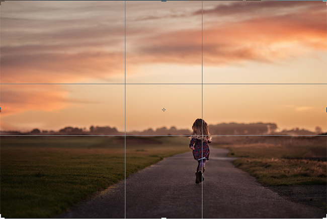
What is the Rule of Thirds?
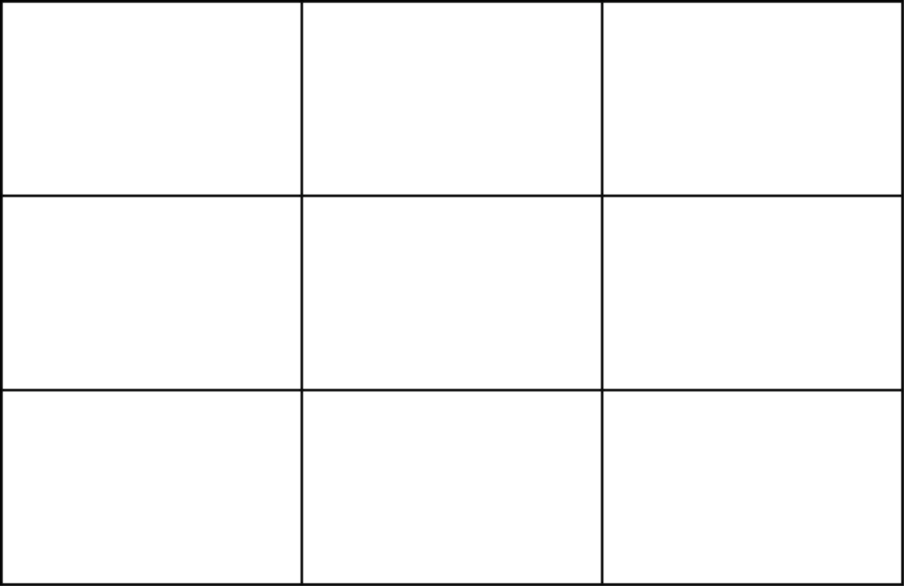
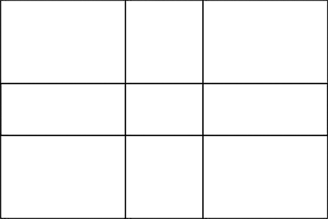
Let’s try to forgive the fact that it has the word ‘rule’ in the name. It is definitely just a guideline and not a rule that can’t be broken. The rule of thirds is a grid. It is made up of two horizontal lines and two vertical lines, which together, create nine equal boxes. It doesn’t matter what shape you choose for your image. It can be a long panoramic or a typical rectangle or a square. The rule of thirds in all of these examples would still just look like 9 equal sized boxes sitting over your image. This makes it pretty easy to visualise with our eyes.
During the Renaissance period painters started using thirds more and more. They realised that the human eye doesn’t rest in the centre of a scene. They knew that the human eye likes to roam and that we should bear that in mind when creating something visual for the eye to look at. These renaissance painters told stories with their art and gave their viewers more to look at.
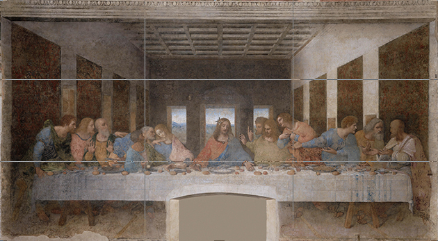
The rule of thirds suggests (‘suggests’ is a better word isn’t it?) that we arrange our scene using the horizontal and vertical lines of the grid and place the most important visual elements where the lines intersect.
So let’s take a typical seascape which might incorporate some land, some sea and some sky. If you were to compose it using the rule of thirds you would give a third of the frame to land, a third to sea and a third to sky.
However, you don’t have to have three parts to your image like this at all.
Let’s say the sky on this day is just beautiful. Let’s say you are there at sunset and the sky is just on fire with loads of different colours of orange and red and pink.
In a scenario like this you don’t want to waste two thirds of your image on land and sea. You want the sky to make up a larger part of your scene. So if you were to use the rule of thirds you would allocate two thirds of your scene to the sky and a third to the sea. Vice versa if the sea happens to be magnificent that day.

https://digital-photography-school.com/seascape-photography-tips/
But let’s add something to this scene. Let’s add a lighthouse. The rule of thirds suggests that you place that lighthouse at one of the four intersections and not in the middle.
You see, the problem with placing subjects smack bang in the middle of your scene is that it gives the eye nowhere to go.
If you look at a photograph and you find the subject in the centre of it you are much less likely to look around at the rest of the scene. You will just move on. If the subject is placed closer to one edge than the other this encourages you to look around at the rest of the scene.
As a photographer, this is what you want your viewer to do!
You are not just a photographer. You are a storyteller. You have arranged your scene in a certain way for a reason. The last thing you want is for someone to only look at the middle then move on to the next distraction. The longer they look, the happier you will be. You have grabbed them and ignited their interest. This is especially important if you have other points of interest in your scene.
This brings me pretty nicely to the counterpoint.
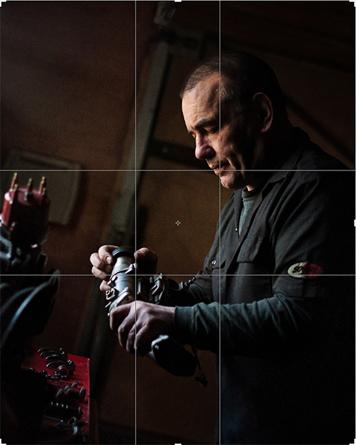
Let’s say you have two points of interest in your scene. If we consider the scene below you might place one point of interest (the man’s face) where the top horizontal line and the right vertical line intersect. So he is top right in the frame.
You have 3 more intersections you can use. Let’s say this second point of interest is the steering wheel of the car he has been working on. The perfect place for it would be the intersection that is diagonally opposite the intersection you placed his face on.
That is your counterpoint.
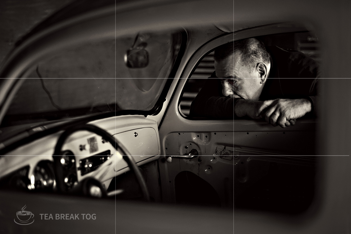
So when you have two points of interest in your image you can try to place them like this – diagonally opposite each other on the rule of thirds intersections. Obviously scenes don’t always work like this and remember, it is just a suggestion. However, when scenes do lend themselves to this you will find that using the counterpoint for your second point of interest will work really, really well. It just works.
So what about the Golden Ratio?
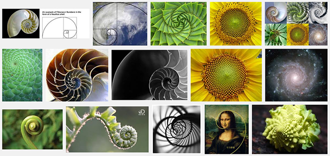
This is known by many names and it dates back way further than the rule of thirds. 800 years ago Fibonacci noticed a ratio that appeared often throughout the natural world. Almost a pattern to the way things were designed by nature and that it was the design most pleasing to the human eye.
Some call it the ‘golden ratio’ or ‘Fibonacci’s ratio’, others call it ‘phi’ (pronounced ‘fye’ by some and ‘fee’ by others). It is also known as ‘divine proportion’. The ratio is 1 : 1.618 and is widely recognized to create a sense of harmony and balance.
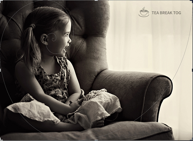
Now if you are like me and not too hot with numbers then that ratio won’t mean much to you. Fortunately, this golden ratio led to the design of the ‘golden spiral’ and the ‘phi grid’ which are graphic representations which we can use to compose our photography. Having a visual is what matters to me. If I can visualize it then I can understand it.

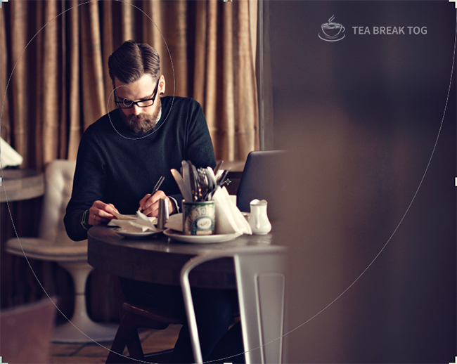
The spiral design, for me, is quite difficult to visualise when I am composing a shot in my camera. I struggle to see it unless it is in front of me. However, the phi grid is much easier to get your head around.
The ‘phi grid’ is similar to the rule of thirds in that there are two horizontal and two vertical lines but this time the frame is not divided into thirds. It is divided according to the golden ratio. Because of this, the intersections are much closer together and they are all closer to the centre of the frame.
This is my go-to tool when I am composing a shot. I am much more comfortable visualising this grid when I am actually taking my shot. In fact, once you get some practice you will not be able to stop visualizing it. You will see it when you are watching movies, you will see it in your favourite logos and you will see it in the world around you. The golden ratio really is EVERYWHERE!
Google image search
You use the golden spiral and the phi grid in the same way as the rule of thirds grid, simply place your most important visual elements along the lines and especially where they intersect.
Something I did a lot in the earlier part of my photography journey was to not really think about composition until afterwards and then just simply crop my image to make it more visually pleasing.
Honestly, there is nothing wrong with this as long as you are not cropping away too many pixels and destroying the quality of your image. A little tweaking with the crop tool goes a long way to improving your image and you will do a lot of this to start with.
As you practice and develop your skills and your eye you will do less and less cropping because you will start to see these grids and spirals in your head.
But, as I say, don’t worry if you need to crop to get your composition right. Keep doing that. It will only improve your photography. I always feel that the more work you have to do after taking your shot makes you more determined to get it right in the camera next time so experience like this is great!
One of the great things about today’s editing software like Adobe Lightroom and Photoshop is that you can turn on overlays with the crop tool. So, every time you crop you will see the overlay of your choice and it will help you create the perfect composition for your image.
My overlay of choice is the ‘phi grid’ but it really is a personal preference thing. Annoyingly, Picasa, which is a popular free editing program does not have the option to crop using a grid overlay. It’s something that is really lacking. You might, however, have the option to turn on a grid in camera so that you see it when you look through your viewfinder. Some photographers like this option and some find it very distracting. Again, it’s all personal preference people!
I have reached the point that I can see the grids in my head when I am composing a shot. You will reach that point too if you haven’t already.
After all that chat about grids and spirals I am going to end by saying you honestly can’t get hung up on this. Yes, use them if they work. They will often help you to improve your image massively.
However, ignore them whenever you like!
Let’s go over three situations that might see you ignoring thirds and golden spirals and phi grids;
Close up portraits
Sometimes when you shoot a real close up of someone it just cries out to be centred or, if not centred, almost centred. Maybe you don’t want the viewer to look around the setting. You just want them to look into the subject’s eyes and get lost in that person for a while. A shot like this is a real study of a human. I often centre close-up portraits like this.

Symmetry
Often you come across symmetry that just cries out to be photographed. If you see symmetry you want to show that in the image and that might mean you have to ignore the rule of thirds or the golden ratio in order to convey that perfect symmetry. Go ahead and do it and don’t give it a second thought. The symmetry of the scene becomes the composition!

https://blog.instagram.com/post/98577192707/sashalevin
Close to the edges
At times you come across an image which gives a huge amount of space to the setting and the subject is actually pretty close to the edge or a corner of the frame. This is usually because the setting is really offering the most interest. Perhaps it is a phenomenal sky or a really awesome desert scene and the subject’s role is more to give perspective and scale. Done well, this can look great!

https://www.pelfusion.com/how-to-create-stunning-sunset-photography/
What I hope you take from this is that there are tools out there which do really help you to compose your images better. I use them all the time. But they can be used and ignored as you please. It is your art – create it in whatever way pleases you. If others like it – well that is just a bonus isn’t it?
For now, I would love to know what your main issues with composition are? Leave a comment below letting me know what you struggle with or which of these overlays you prefer…
The post Rule of Thirds or Golden Ratio – which should you use? – Ep.25 appeared first on Tea Break Tog.
From The Podcast
Tea Break Tog Photography Podcast
Do you want to improve your photography but are turned off by all the jargon, tech and science? Do you struggle to find the time to develop your skills?My name is Julie Christie and I host the Tea Break Tog photography podcast. My show aims to deliver straight-forward photography lessons, tips and chat to you every week. Episodes are short and focused meaning this is learning that will fit easily around your busy schedule. Let me help you to take control of that camera and capture stunning images!For more information visit www.teabreaktog.com. To get in touch simply click the contact tab on the website or tweet me @TeaBreakTog!Join Podchaser to...
- Rate podcasts and episodes
- Follow podcasts and creators
- Create podcast and episode lists
- & much more
Episode Tags
Claim and edit this page to your liking.
Unlock more with Podchaser Pro
- Audience Insights
- Contact Information
- Demographics
- Charts
- Sponsor History
- and More!

- Account
- Register
- Log In
- Find Friends
- Resources
- Help Center
- Blog
- API
Podchaser is the ultimate destination for podcast data, search, and discovery. Learn More
- © 2024 Podchaser, Inc.
- Privacy Policy
- Terms of Service
- Contact Us